Using a Color Picker
 Often you see images on a website or photo that you like, but you may not know how to get the exact RGB or Hex codes to use them. You can use a color picker app to identify colors on your screen.
I use Color Cop on Windows and the Coolors Generator in my browser. You can find other options (free and paid) for Mac and Windows by googling for "color picker."
Today’s #InfographicInspiration focuses on colors. When working with tables, you can use shading and borders as part of your document design. Chosen well, colors can greatly improve a project, making the information more readable by creating contrast and highlighting important details. Chosen poorly however, colors can make a project harder to read because they lack contrast or distract from the information.
Think about how you use a highlighter in your notes or a printed book. If you highlight an entire page, essentially nothing is highlighted. Nothing can stand out. You have to have contrast between highlighted words and the rest of the page. Likewise, if your highlighter is drying out, it can leave very faint marks on the page. Again, there isn’t enough contrast between the elements on the page.
To make the most of your color choices, consider the ideas in today’s infographic. Any one of the ways of linking colors can make a nice contrast (e.g., choosing complementary or triadic colors). At the bottom of the infographic, you’ll find color palettes of combinations that work well. Do note that the infographic is British, so it uses British spelling.
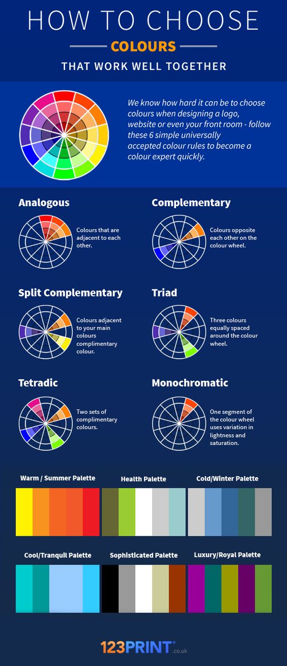
Transcript for this image is available.