Lynda.com Login Help
Lynda.com videos are free to Virginia Tech students with your VT.EDU login. Start at the VT.EDU login page to access these resources.
One of my favorite ways to talk about strong document design is the CRAP method. CRAP stands for Contrast, Repetition, Alignment, and Proximity. Using all four of these elements helps give your work a polished appearance and catches readers’ attention.
This week’s #InfographicInspiration (from Paper Leaf Designs) gives you a quick overview of all four elements. It is worth saving for future use, and try applying it to your professional biography assignment before you turn it in on Monday.
For a more detailed explanation of the CRAP elements, watch the Lynda.com video, Understanding the PARC system (Lynda.com was apparently afraid to say CRAP, so they spell it backwards).
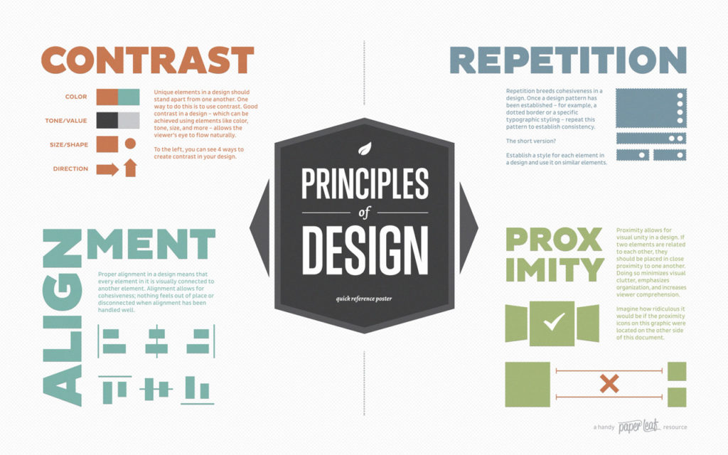
Note: This infographic has a text-based transcript.