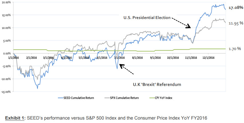
You can often show trends and comparisons with graphical elements than with text descriptions. Consider the difference between describing the performance of a stock or a portfolio during the last year and showing that performance with a line chart. Here’s an example from the Student-managed Endowment for Educational Development (SEED) 2016 Annual Report. Which seems easier to read and process to you?
Text Description
The portfolio performed relatively in line or slightly below the respective benchmark until the final quarter, as shown in Exhibit 1. We included the Consumer Price Index as a preservation of spending power benchmark to monitor changes in our real returns. From mid-November to year-end, the portfolio significantly outperformed and finished 2016 with an active return of 5.13%. In order to calculate our risk-adjusted return, we incorporated our portfolio’s beta of 1.2 and historical average for yields on the 1-Year Treasury note (1.84%) in order to compute a CAPM-based implied alpha. This calculation resulted in an implied 2016 alpha of 3.11%.
Line Chart
For my money (yes, a pun), the line chart is much easier to understand quickly. In many circumstances, you will include both a text description and a graphical representation. The point of today’s post is that the graphical version is not just an illustration. It is critical to showing the reader information about the topic.
For your #WednesdayWrite, think about how you can add graphical representation of information in your progress report. The infographic below shows a collection of graphics you can use to communicate information. Visit the post How to Think Visually Using Visual Analogies from Anna Vital for a larger version of the image and short details on the various kinds of charts and graphs.
Once you explore the options, add a comment that discusses a graphical representation that you might use in your Progress Report. Talk about what you have chosen, how you will use it, and why it will be effective in communicating with me about your progress.
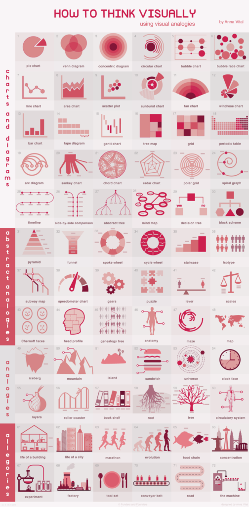
Source: How to Think Visually Using Visual Analogies from Anna Vital
Note: This infographic needs a text-based transcript. See the Optional Accessibility Transcript Activity for more details.