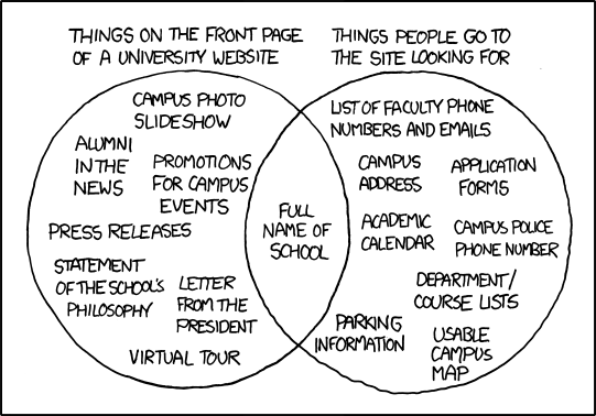
Many of you have probably already seen the XKCD comic below, titled “University Website.” Beyond being a funny reflection on what you see on college websites, it’s a great example of what goes wrong when composers fail to think about what their audience needs. The people who decide what goes on these websites are meeting someone’s goals, but not all of the people who go to the site for information. I haven’t compared all the items in the comic to the Virginia Tech website, but I suspect that a lot of the details are quite true.

Permanent link to this comic: https://xkcd.com/773/; Long Desription below.
You can participate today in two ways: adding a comment that analyzes a university webpage, OR replying to someone else’s comment and explaining why you agree (or disagree) with their analysis. The details on the two options are below:
Option 1. Add a Comment Analyzing a Webpage
Our activity this week is to complete a similar analysis of another webpage. Find a page on the Virginia Tech website, and compare what shows on that page to what you would look for when you go to that page. I have some guidelines for you:
- Choose a page that is in the vt.edu domain. You can look at a page for your major, a course, resources you use on campus, and so forth.
- OR choose a page that is clearly related to Virginia Tech, such as a page for a club, Greek organization, and so forth. If you’re not sure, send me the link and ask me.
- You may NOT use any page that I have written or that is about me. That just gets weird and awkward.
Once you choose a page, do this:
- Tell us the name of the page (for instance, English Dept homepage).
- Share the link in your comment.
- Talk about what you see there.
- Talk about what you think people would go there for.
- Draw some conclusions about how well the page meets the needs of its audience.
Finally, you are just making a comment. You’re not trying to write a formal comparison-contrast essay. Use short lists or fragments, whatever will make sense to people who read your comment.
Option 2. Reply and Discuss Someone Else’s Analysis
You can reply to a comment someone else has made (or even several people if you want). Your goal would be to think about whether you agree with that commenter’s analysis and explain the reasons for your response.
Comic Description
By XKCD
A venn diagram. The left circle is labeled "things on the front page of a university website" and contains "campus photo slideshow," "alumni in the news," "promotions for campus events," "press releases," "statement of the school's philosophy," "letter from the president," and "virtual tour."
The right circle is labeled "things people go to the site looking for" and contains "list of faculty phone numbers and emails," "campus address," "application forms," "academic calendar," "campus police phone number," "department course lists," "parking information," and "usable campus map."
The only item in the overlapping section is "full name of school."
Title text: People go to the website because they can't wait for the next alumni magazine, right? What do you mean, you want a campus map? One of our students made one as a CS class project back in '01! You can click to zoom and everything!